
Coaching Systems Rebrand
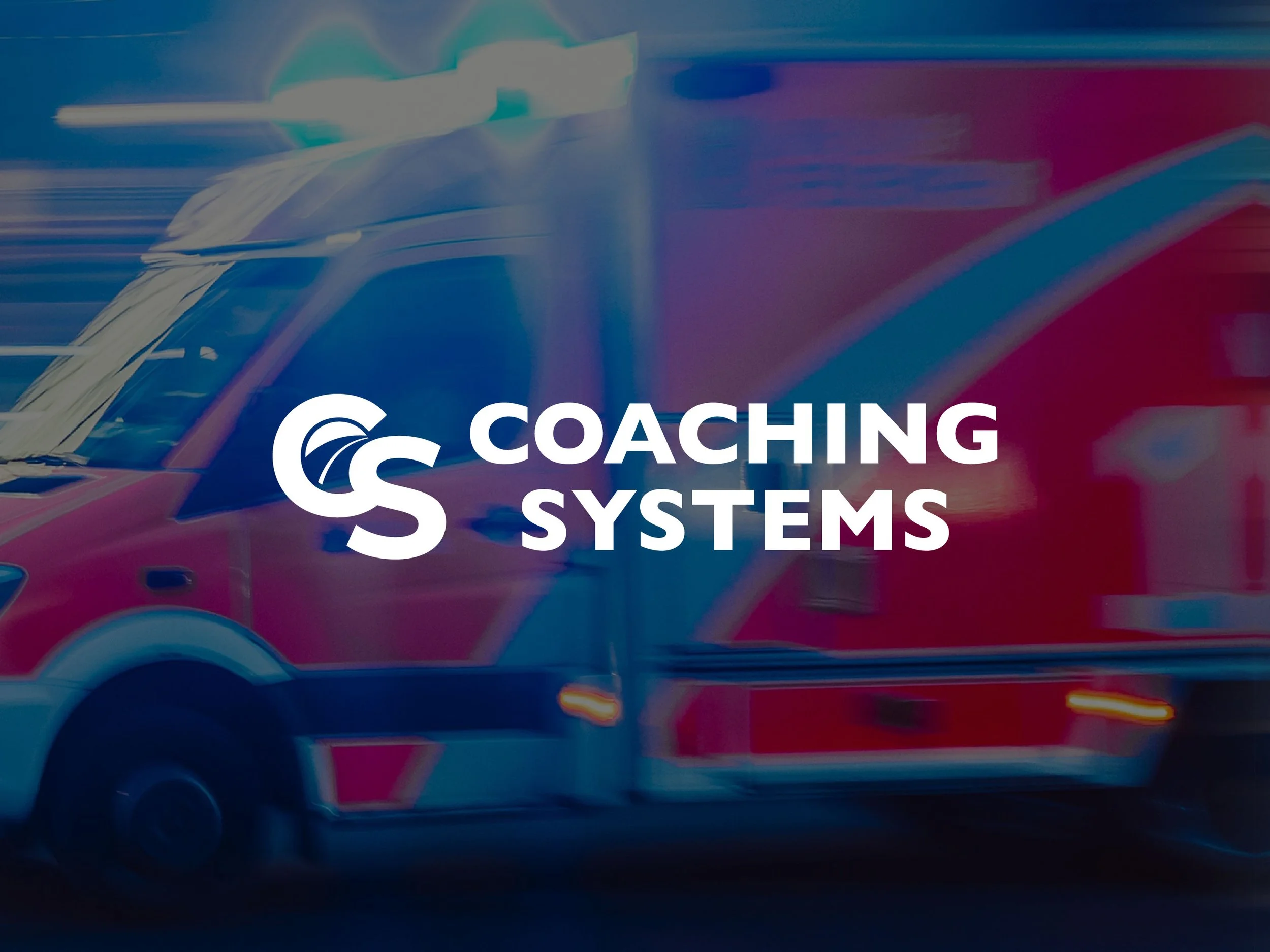
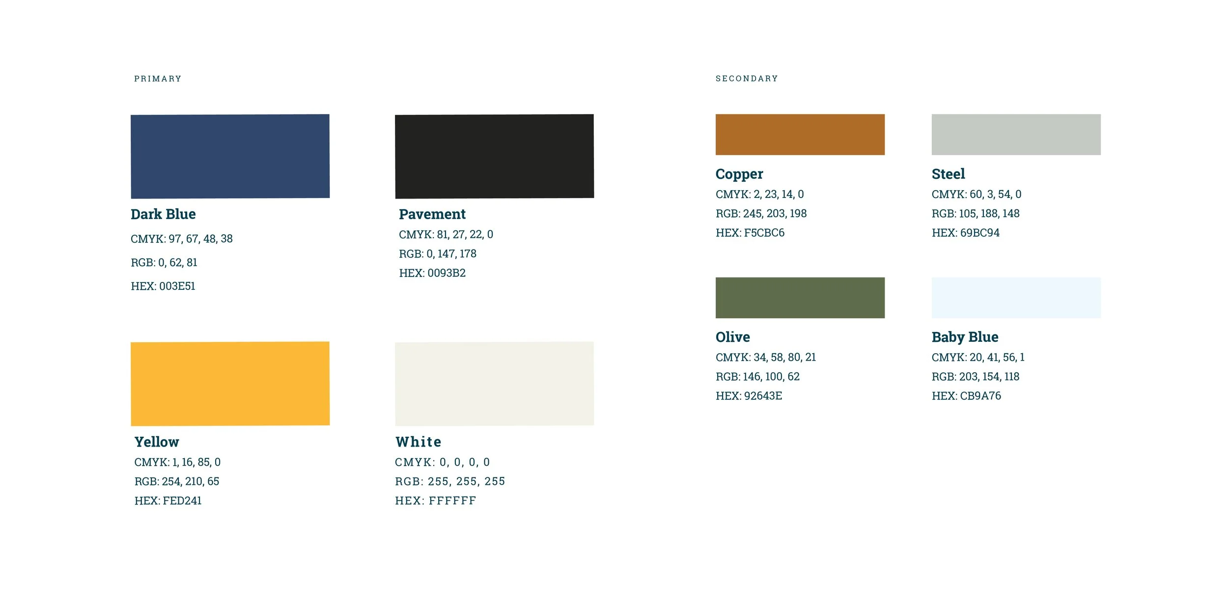
Coaching Systems creates and distributes professional driver programs helping to train and certify commercial vehicle operators. They were established in 1983, and nearly 40 years later, they decided it was time for a brand refresh. They wanted to modernize everything from their logo and visual identity, to their individual course logos and even the illustrations they use in the actual course response books. The goal was to just modernize the experience, making the content feel a bit more current and trustworthy.
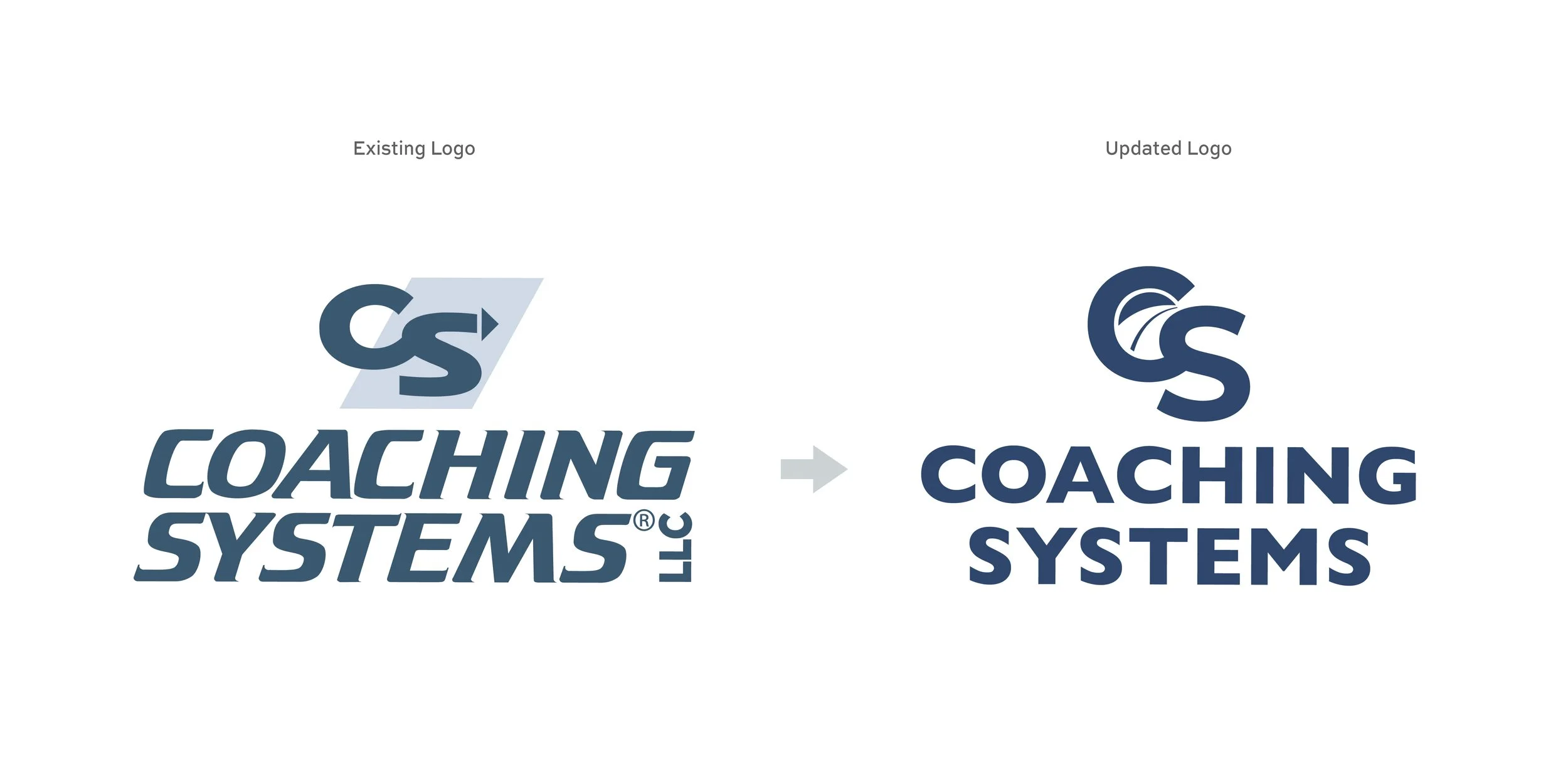
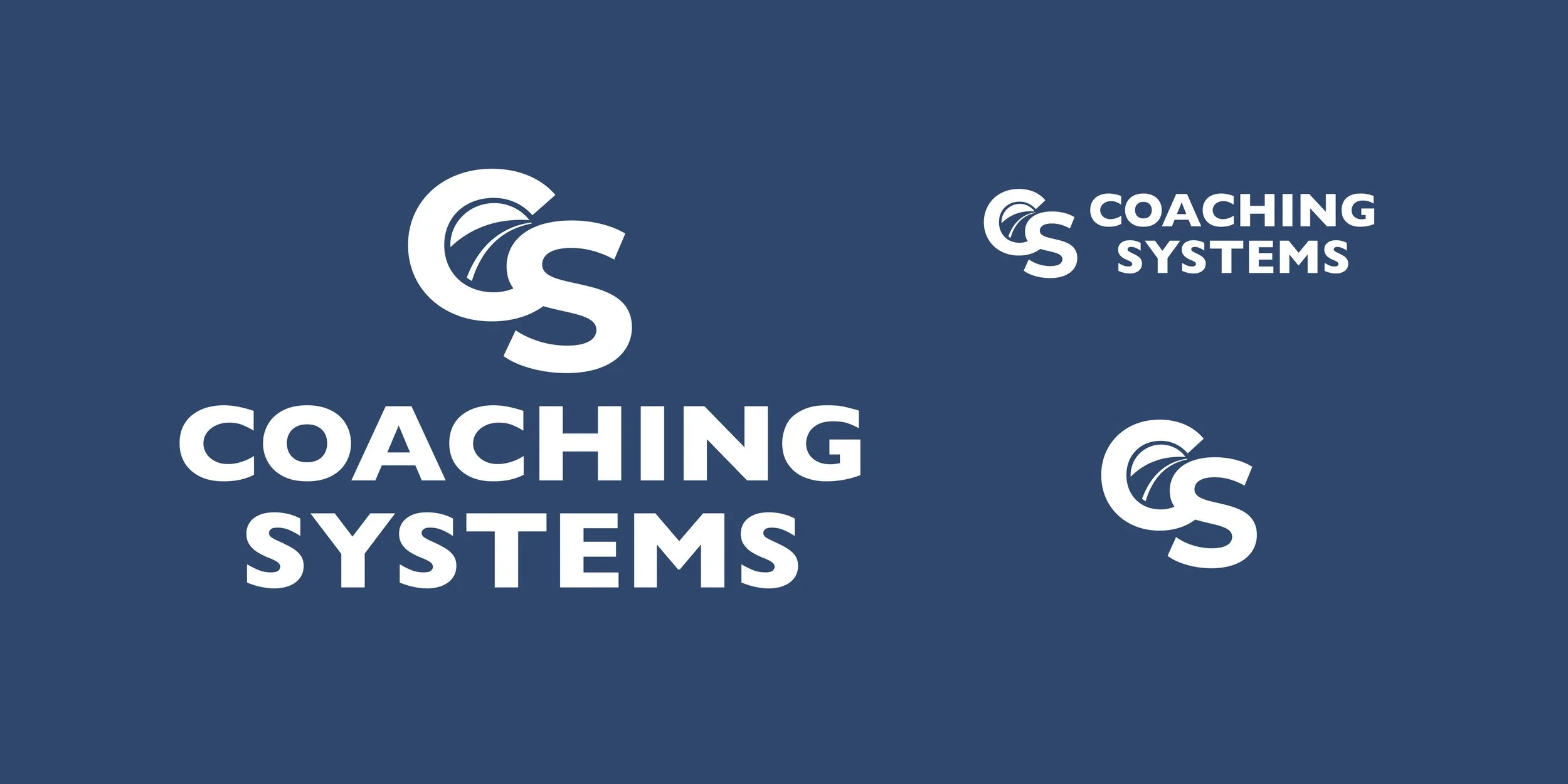
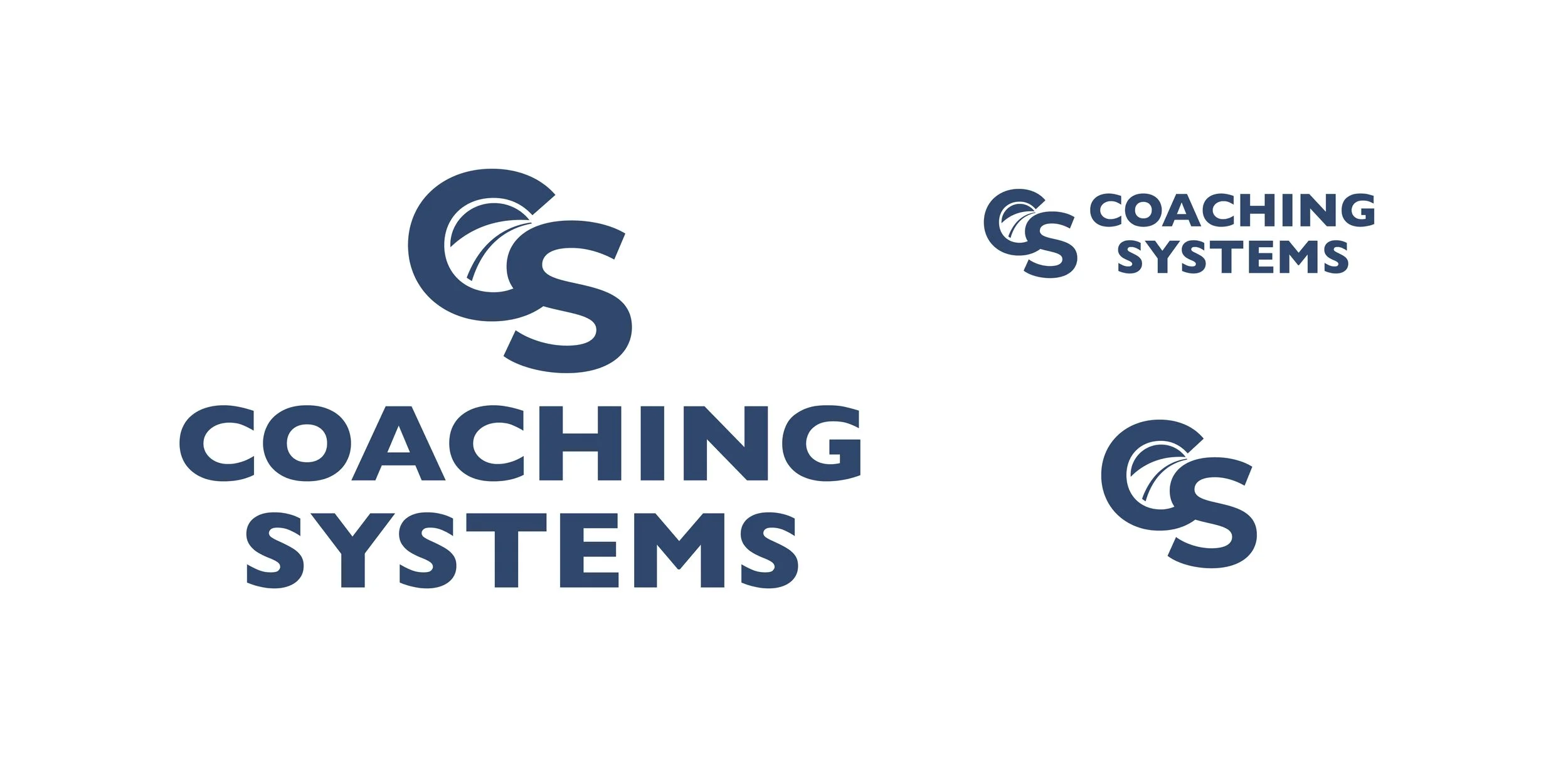
The existing logo had some challenges, including the fact that it relied on two colors, and the type was a bit outdated. We created an updated version of the logo without deviating too far from what they were currently using. The new logo also nested a roadway within the C, making it more unique and tying it back to their product.
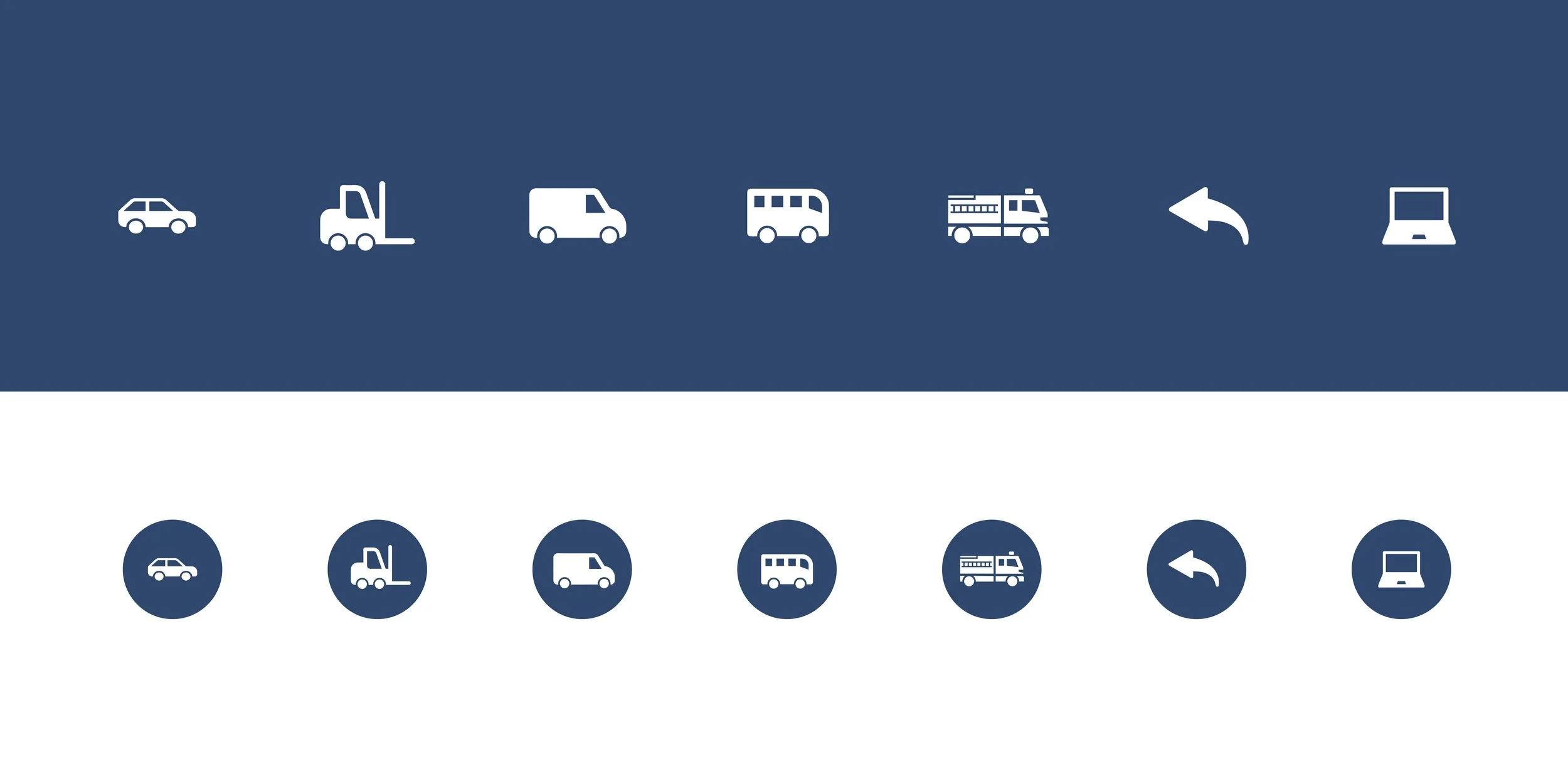
Coaching Systems was also in need of some updated icons that would live on the website to create a more modern, cohesive product category system.

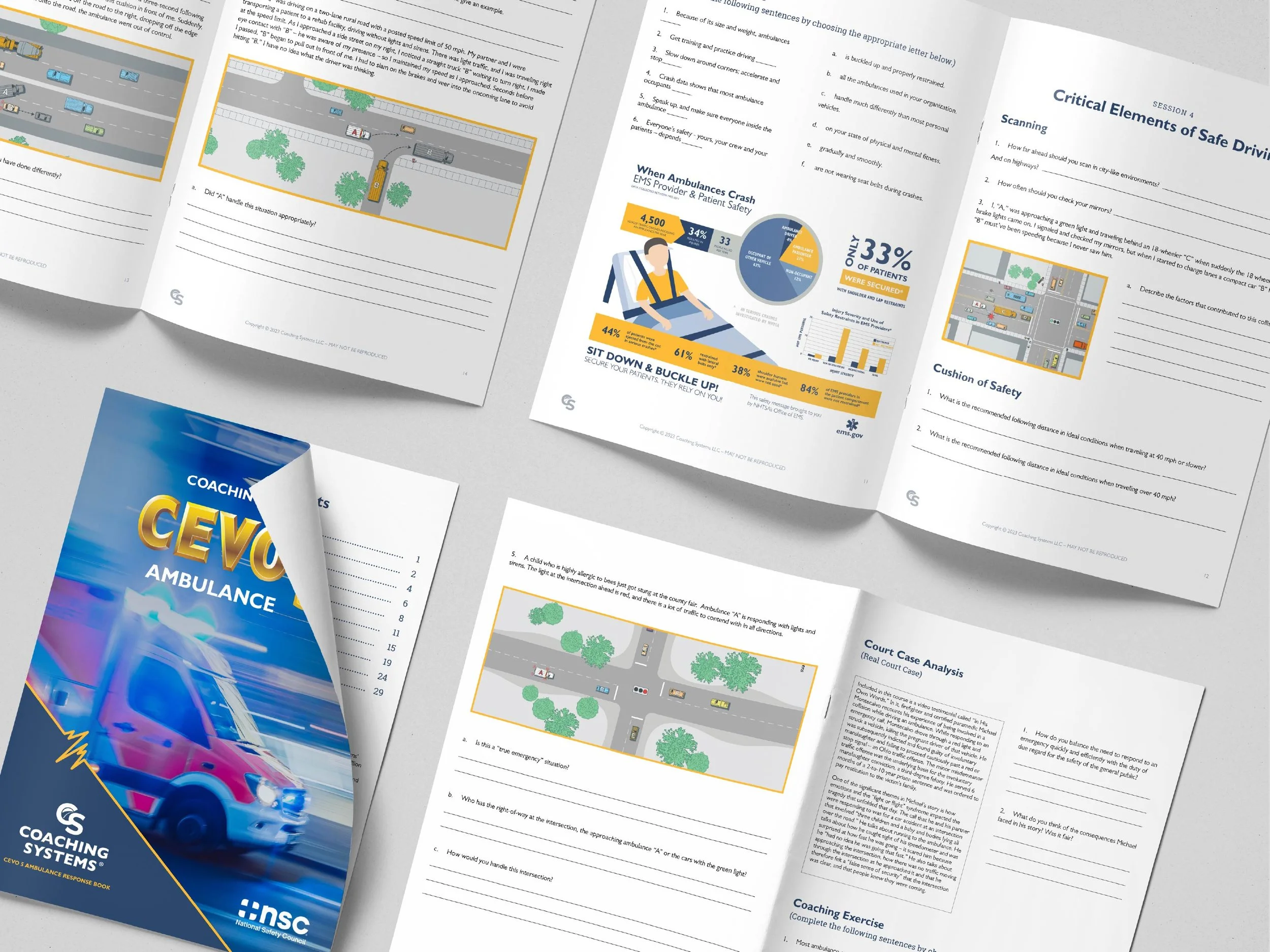
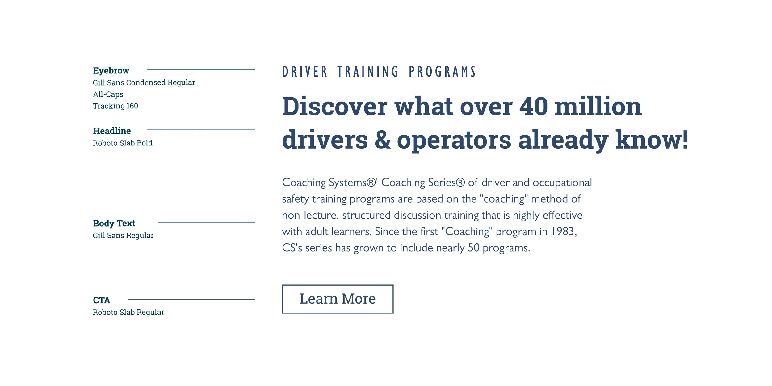
On top of the rebrand, I helped Coaching Systems redesign their website and a few of their program’s response books. Again, updating these assets to feel a bit more modern, ultimately helped the overall effectiveness and created clearer communication.
