
COPA REBRAND
Copa is a canned tequila cocktail company operating out of Central New Jersey. They had successfully existed in the market for about 2 years with their original identity before initiating this rebrand. They really liked the overall feel of their existing branding, but recognized there were some design flaws, and wanted to revisit their logo, packaging, and brand identity as a whole.
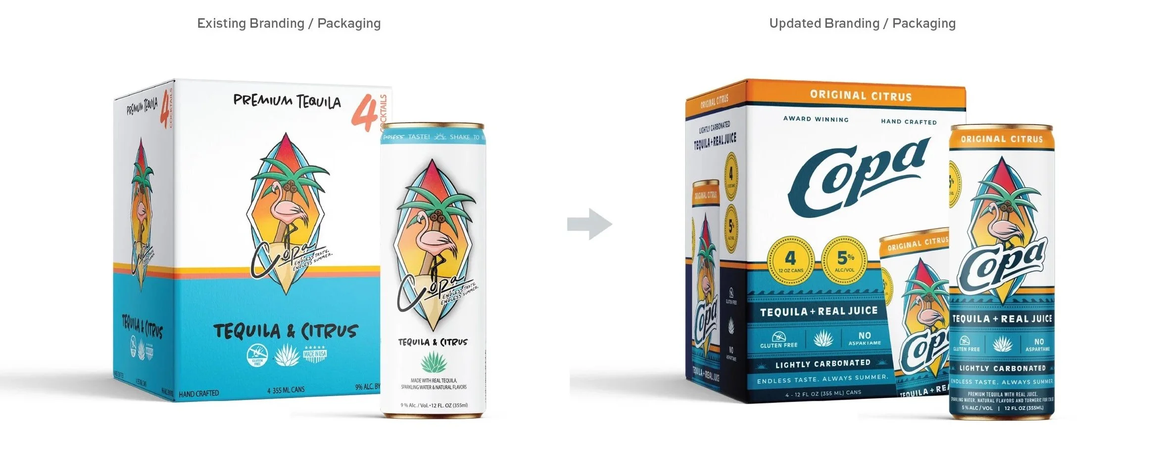
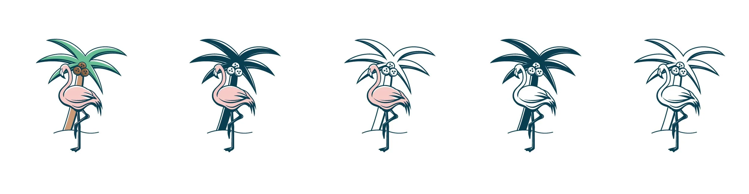
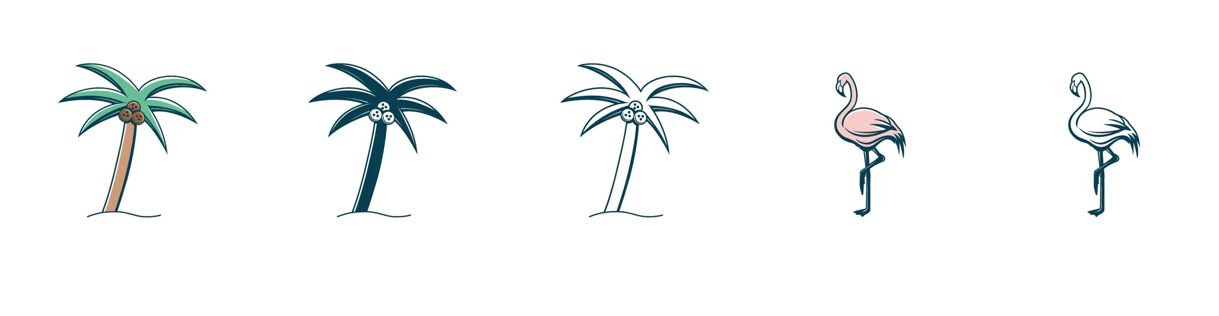
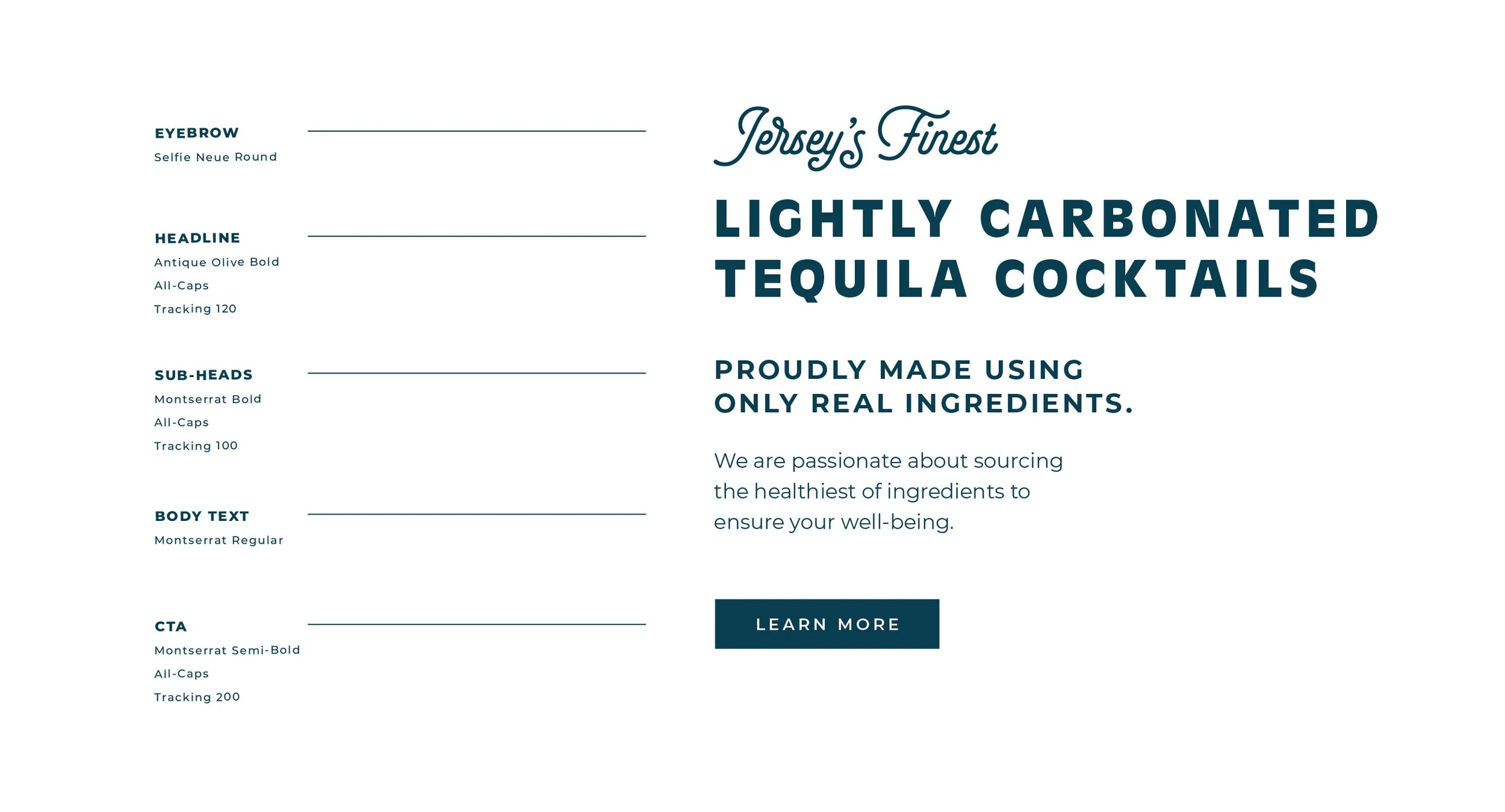
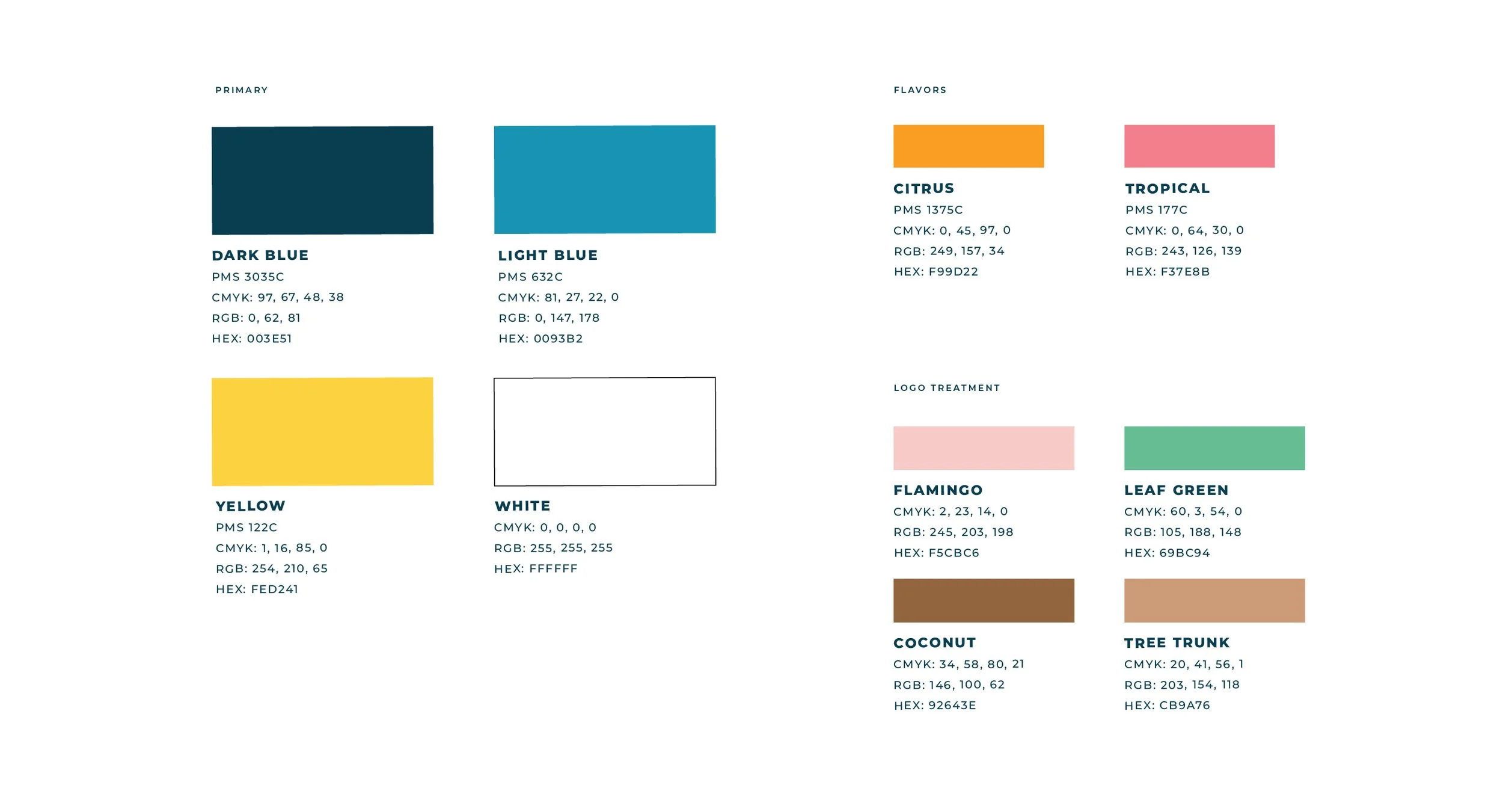
We began the rebrand by simplifying the Copa icon, reducing the color palette and developing a version that could work seamlessly in a single color. Alongside it, we introduced a new wordmark designed to stand on its own while also pairing naturally with the icon, making the brand more flexible and recognizable.
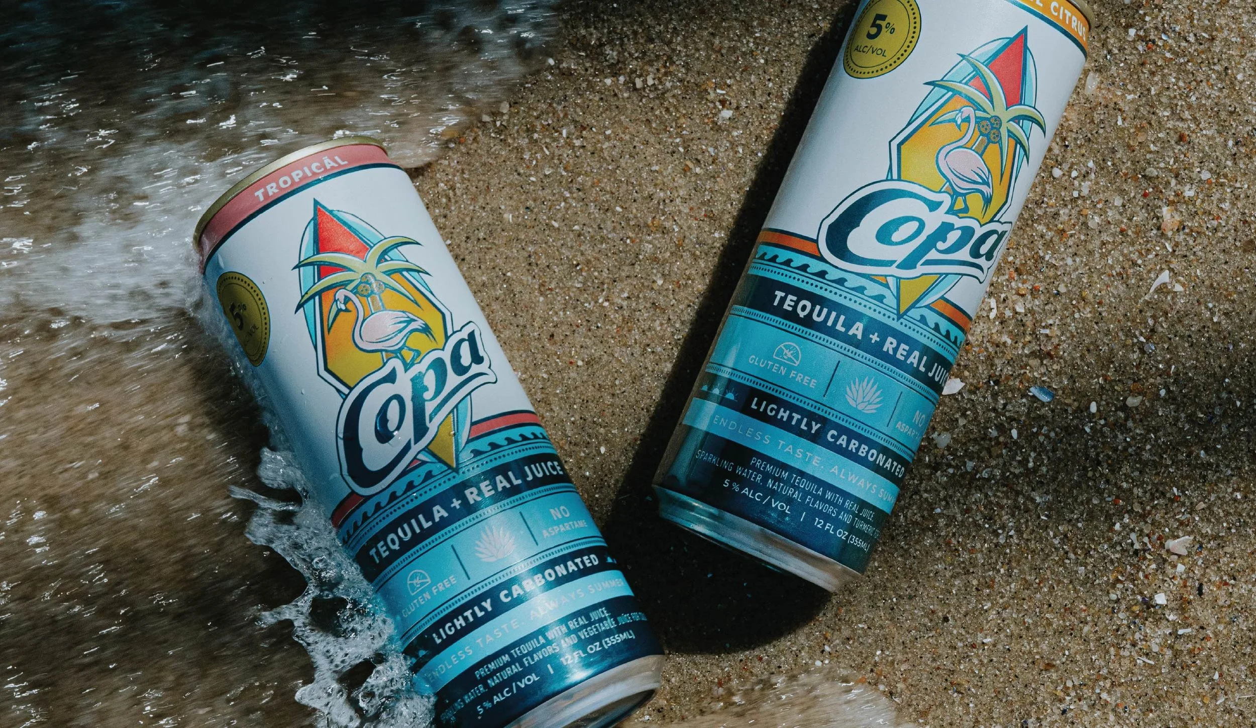
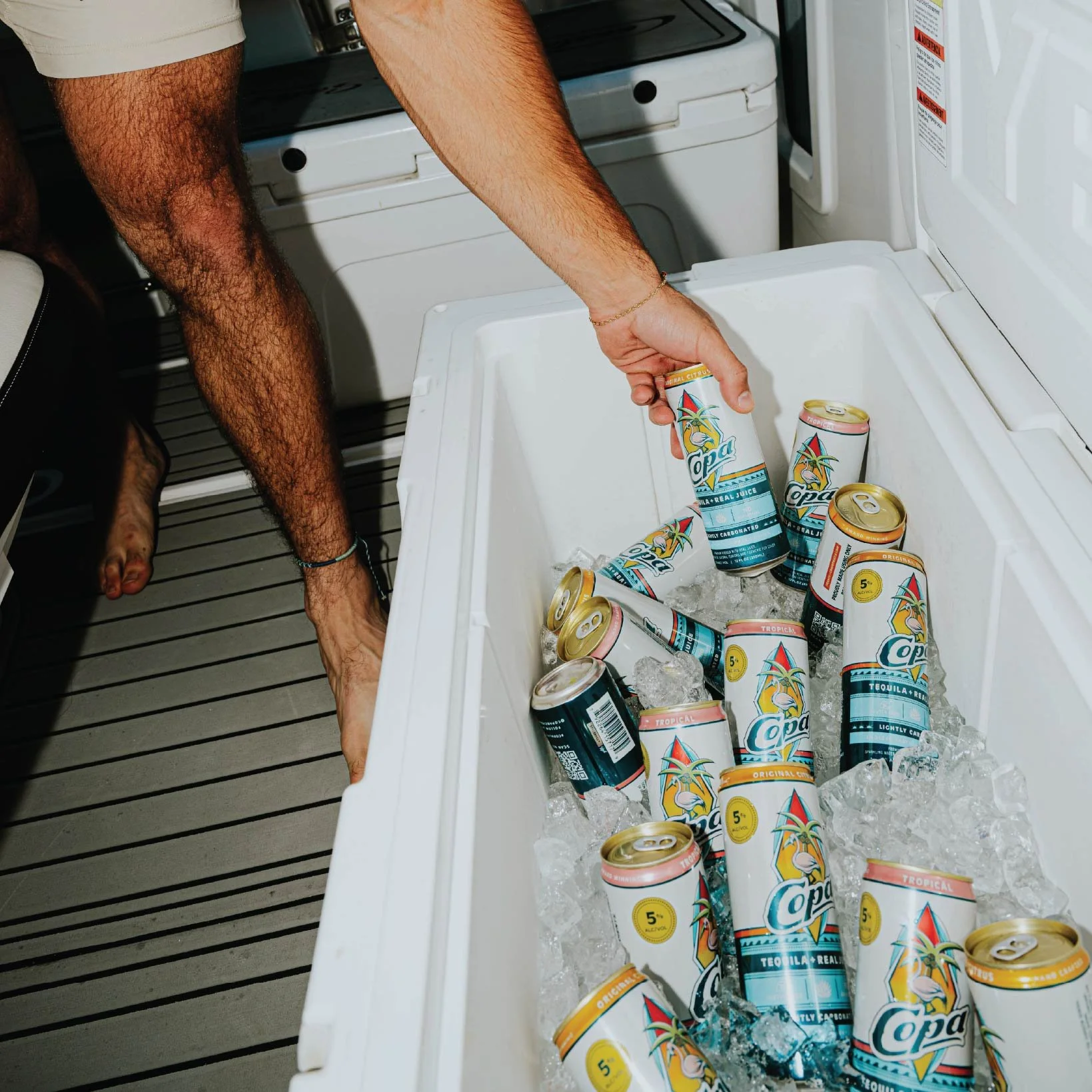
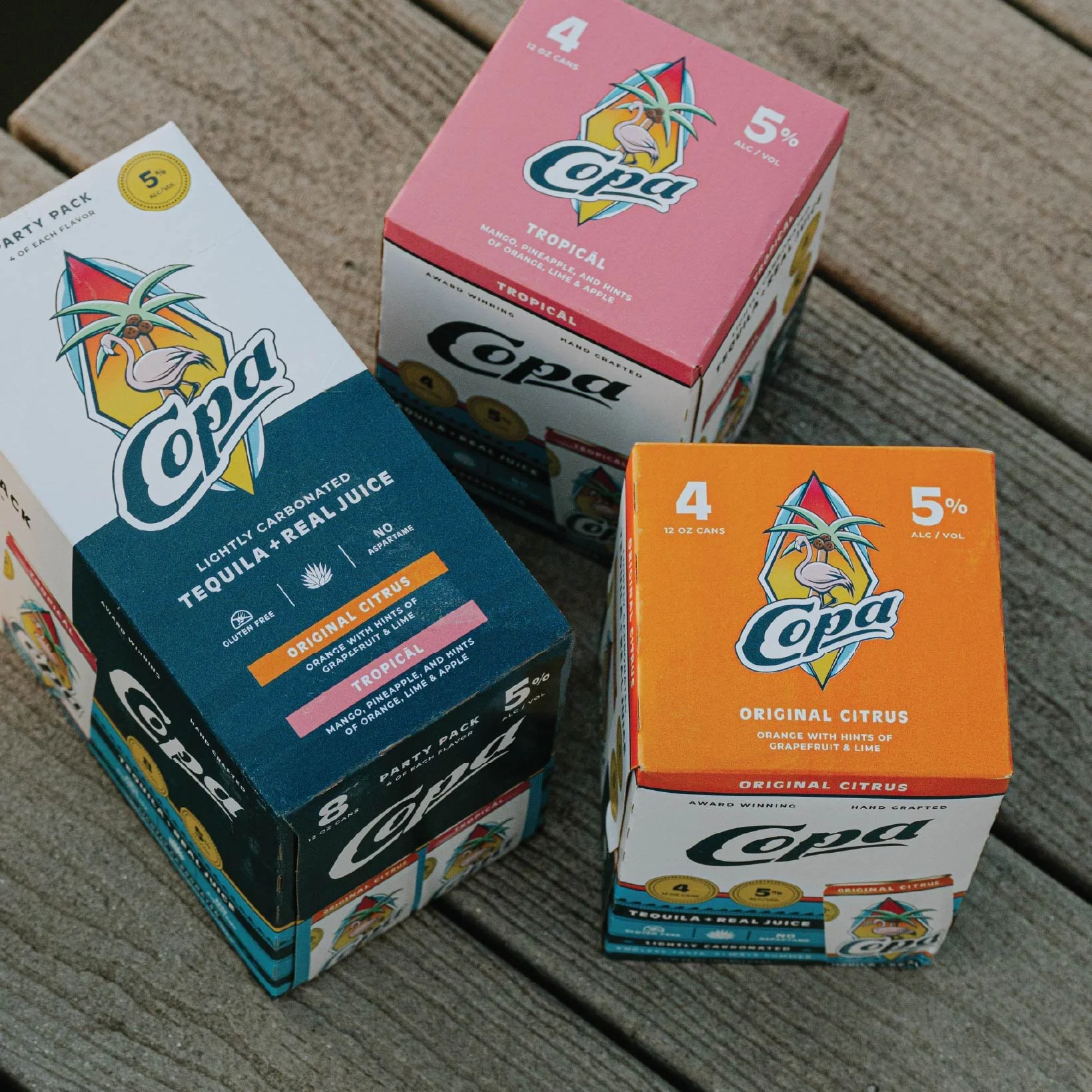
With the identity in place, we turned to packaging. The goal was to strike a balance between fun and beachy, while still feeling premium and elevated, carrying forward elements that were already working, but refining them into a more cohesive and impactful system.
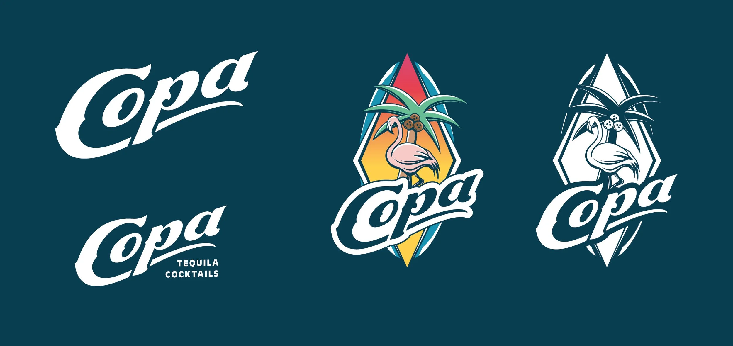
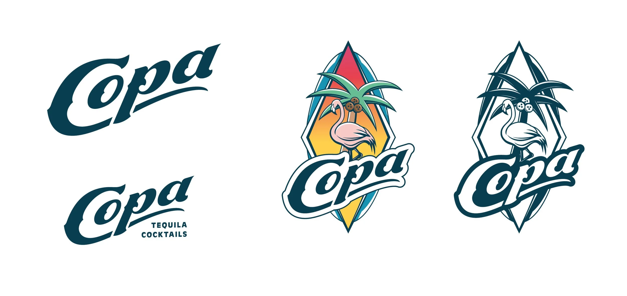
We created a few versions of the logo, and separated some of the icon’s elements out to create a super flexible system of icons and graphics.
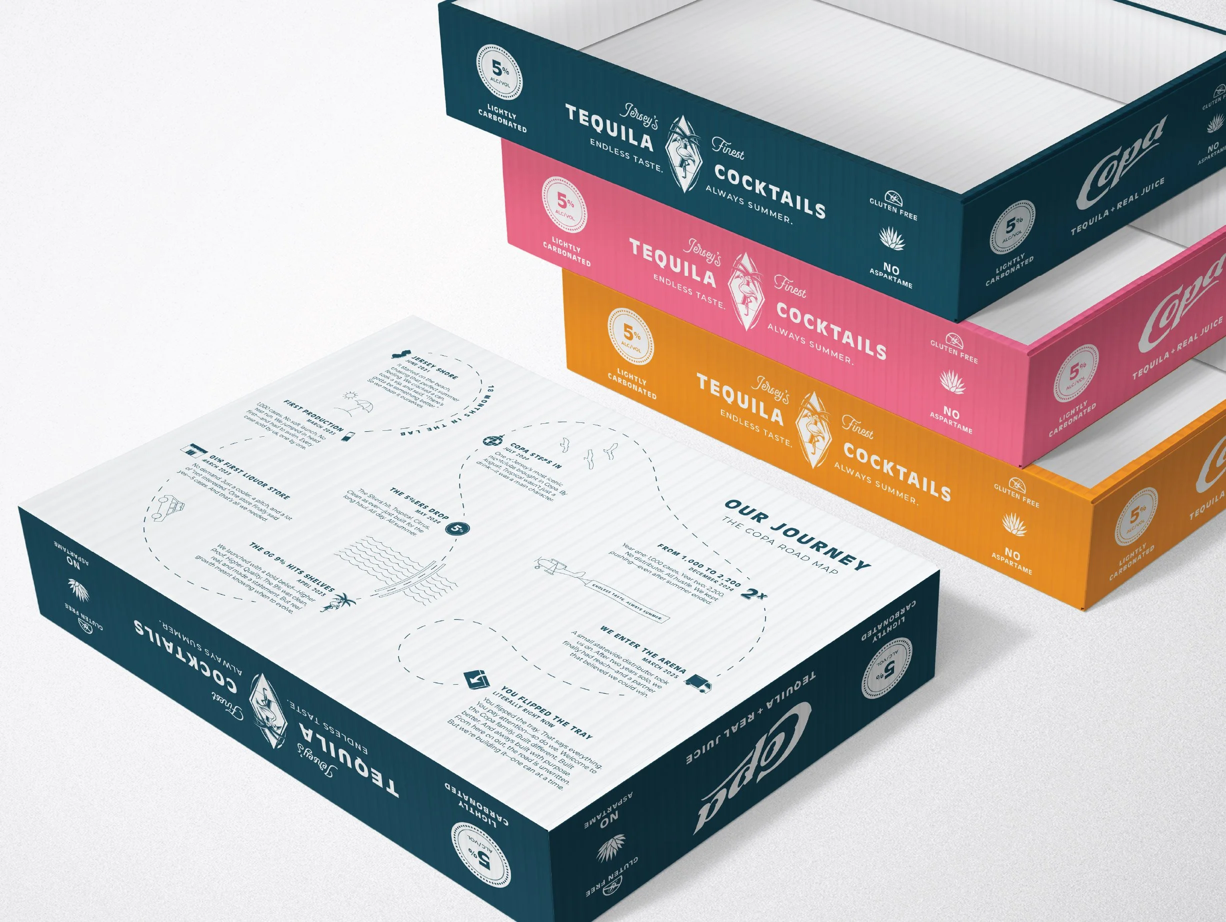
Retailers often leave product in the shipping trays before unpacking and merchandising, which created an opportunity to make the tray itself more impactful. As a subtle detail, we added a timeline to the bottom of the tray. For the few people who happen to flip it over, it reveals a personal origin story, an unexpected easter egg built into the packaging.
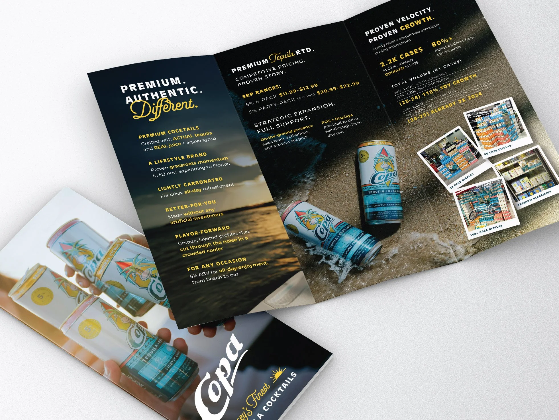
As Copa grew and started targeting larger distributors and retailers, they needed a piece that could both build awareness and support conversations. We created a brochure that tells the Copa story while clearly communicating key selling points, helping build confidence with potential partners.
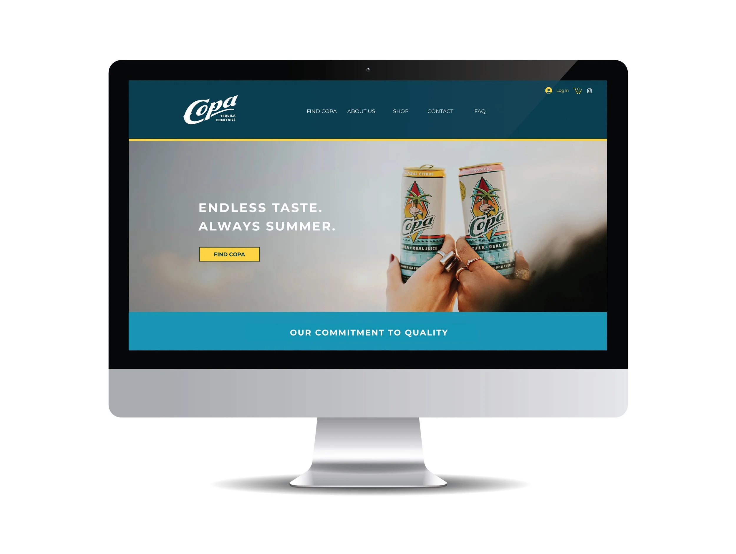
The final deliverable for this project was getting their website updated to reflect the brand changes. We also created a line of Merch where we got to have a bit of fun. The goal was to create something that felt more “fashion”, and less “promo”.


