Spano Psych
Spano Psychological is an independent, Philadelphia-based psychotherapy and neuroevaluation practice. After years within larger organizations, Dr. Spano set out to build something more personal, shaped by her own perspective and approach to care. Her philosophy centers on the idea that mental health is not driven by therapy or medication alone, but through a balance of clinical support, lifestyle, and overall well-being.
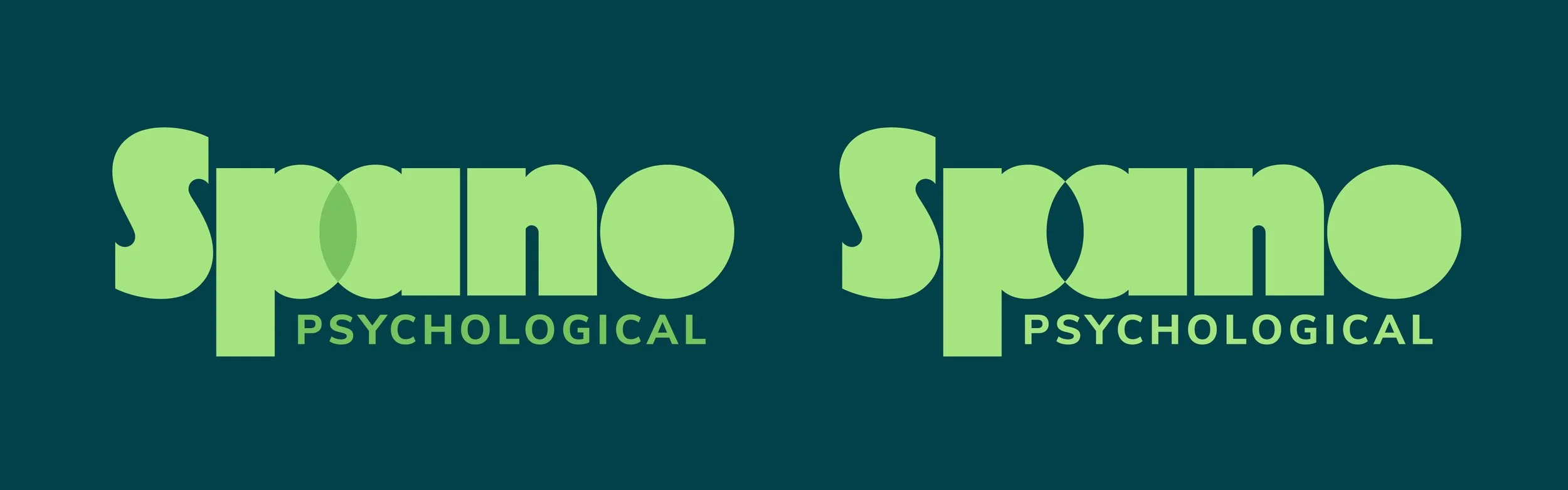
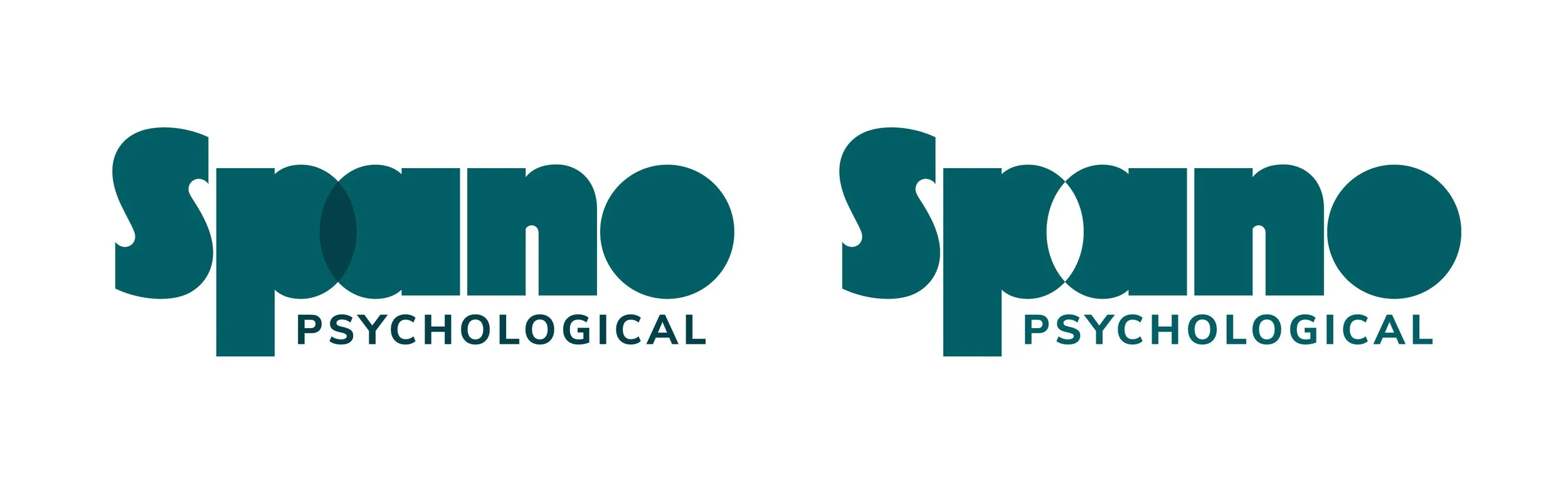
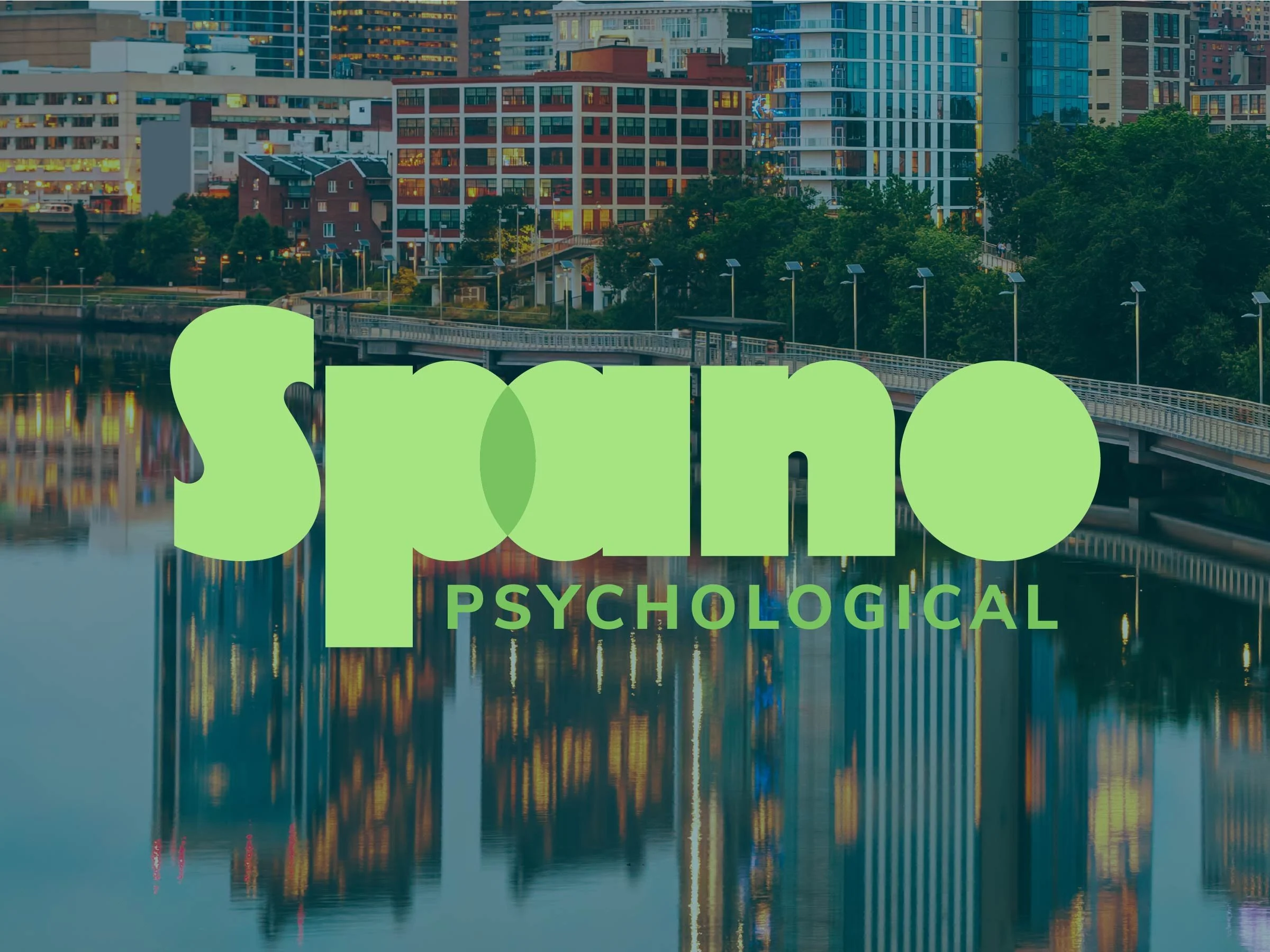
The identity was designed to feel immediately approachable while reflecting Dr. Spano’s philosophy. Rounded, geometric letterforms create a tone that feels friendly, optimistic, and distinctly non-clinical, moving away from the rigidity of traditional healthcare branding.
An intentional overlap between the “P” and “A” forms a central visual moment, symbolizing the balance between therapeutic work and healthy lifestyle habits. This intersection represents the state of wellness her practice aims to help clients achieve.


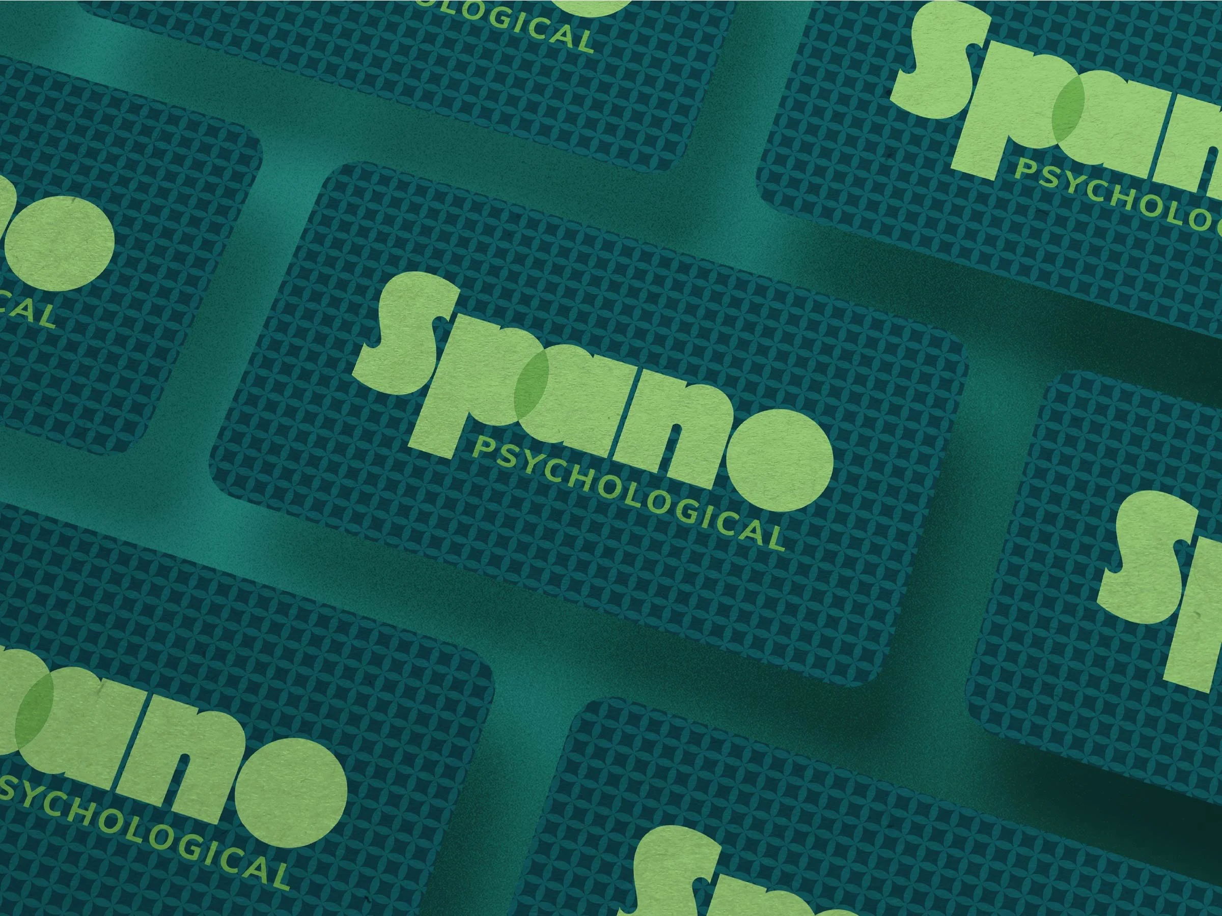
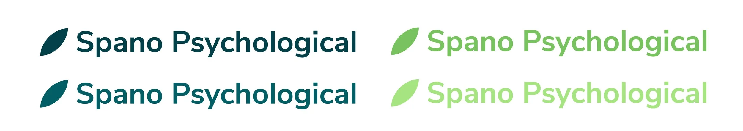
The overlapping forms also create a subtle leaf shape, an organic symbol of growth and renewal. This element was isolated and extended into a flexible graphic device, used both as a standalone mark and as a repeating pattern across the brand.
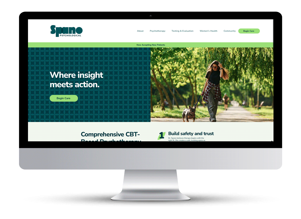
The website was designed to be a welcoming first impression for new clients. It’s simple to navigate and clearly communicates what makes Spano Psych different. It pairs client-provided copy with intentional design and content structure. Altogether, it reinforces that this practice is personal, approachable, and far from your typical corporate office.
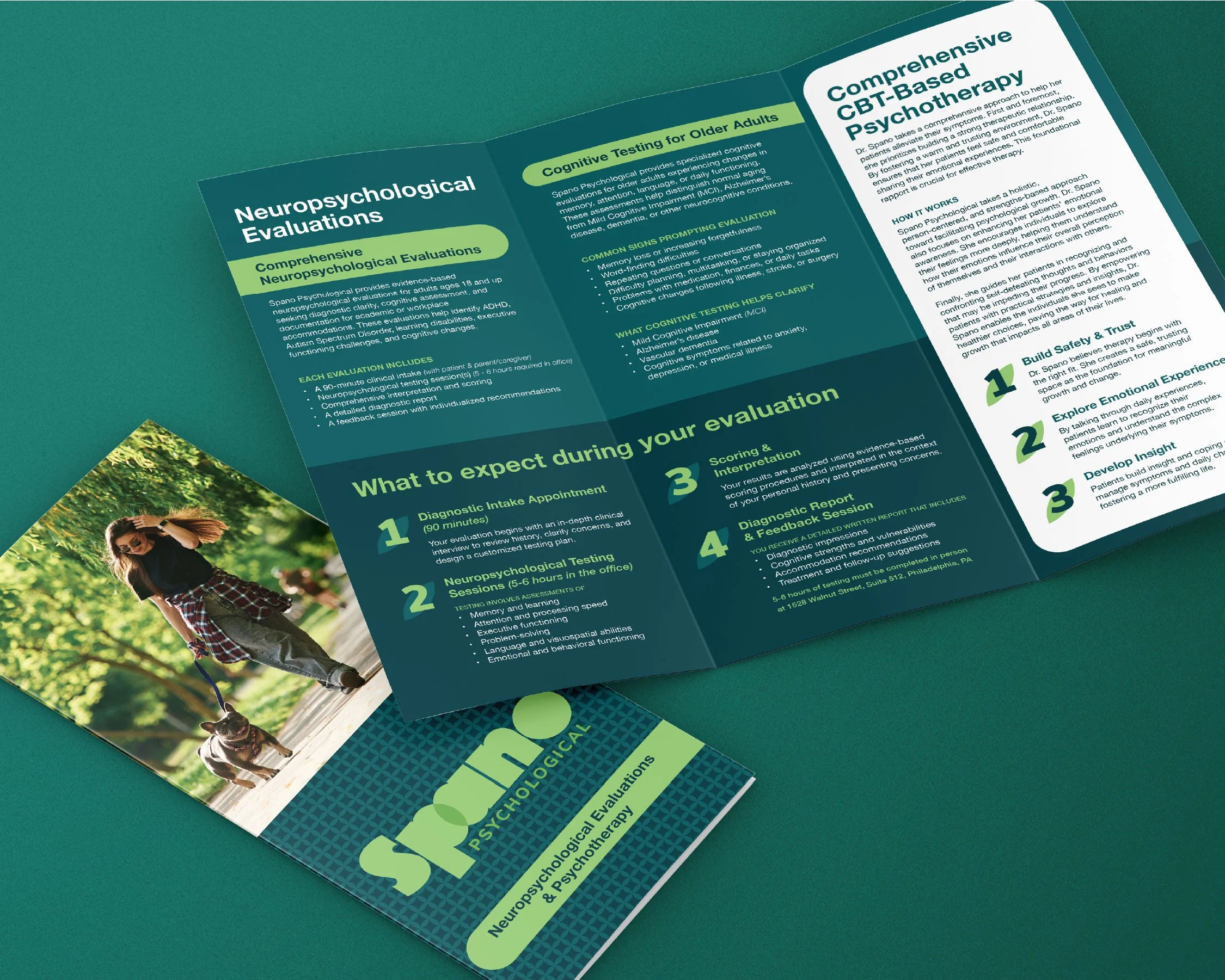
To support the launch, we developed a printed brochure designed for targeted outreach. Dr. Spano had built a strong network of referring physicians, and this piece provided a thoughtful, tangible way to reintroduce her services, clearly outlining specialties while reinforcing the brand’s tone and credibility.